Tuesday 16 December 2014

Draft Evaluation Question 1 -


In what ways does your media product use, develop or challenge forms and conventions of real media products?

Whilst creating my digipak, advert and music video, I have looked to existing products for inspiration and have chosen to emulate a variety of professional techniques, to make my products appear professional and realistic. 

Digipak -

Whilst designing my digipak, I emulated specific conventions, which I discovered from my research into existing products. 

Whilst designing my front cover, i was heavily influenced by The Arctic Monkeys CD cover from the single 'When The Sun Goes Down.' This particular front cover caught my eye because of its simplicity and ability to intrigue the audience. I wanted my digipak front cover to have the same effect on the audience and so decided to use a number of the conventions which feature on this particular cover. I opted to use a black and white, urban, grungy image as i felt that it suited both my chosen song and the overall image of my band. I then used another convention from the Arctic Monkeys cover. To me, the text positioning and overall appearance was very interesting, and suited the urban image, therefore, i opted to use this convention on my front cover. I opted to place my bands name and the album title in white boxes and positioned them in the top left corner of the page. However, here, i chose to challenge this particular convention by using a larger, bolder font, and by using a box without rounded corners. I also decided to add an image to my bands logo, to challenge this particular layout. By adding a memorable, simplistic image, in this case, a feather, i was hoping to fill unnecessary space, which was a feature i disliked about the original front cover.


Arctic Monkeys 'When The Sun Goes Down' front cover

My version of the 'When The Sun Goes Down' front cover


The second panel of my digipak features the band logo and the names of the band members, as well as their roles. Here, i opted to use the conventions which feature on the Beady Eye digipak 'The Roller.' The panel which featured on this digipak portrayed the band logo at the top of the page, with the band members and their roles below. I opted to use these techniques to give the audience a clear insight into who the band members are and what roles they play in the band, to create a familiar relationship between the audience and the band. 


'The Roller' by Beady Eye features conventions which i chose to use whilst designing the second page of my digipak.

This is the second page from my digipak. It features conventions from the 'The Roller'  I chose to use conventions such as listing the band members and their roles to create a relationship between the band and the audience,


 The third panel of my digipak features the disc or CD. Here, I opted to emulate more conventions  from the Arctic Monkeys “When The Sun Goes Down” digipak. Whilst designing my third panel, I opted to use the repetition of my bands logo and the name of the song, to add more interest to the disc. However, I also challenged this particular convention, as I chose to stretch an urban image over the entirety of the page, so that the background and disc merged together, making the overall appearance of the page neat and professional and more interesting and appealing to the audience.

Disc which features in the Arctic Monkeys 'When The Sun Goes Down' digipak


Disc which features in my digipak. Here, i have used and challenged the conventions used on the Arctic Monkeys 'When The Sun Goes Down' disc.
The fourth panel of my digipak features an image of all four band members. Although I didn't emulate this panel from an existing digipak, i did in fact emulate the style from a variety of images of indie rock band photography. I wanted to include an image of the entire band to clearly show the audience who the band are (in order to introduce each member) and to match the names which feature on panel two. 


Image of indie rock band The Arctic Monkeys.


Image of my band The Rituals. 


Whilst designing my fifth digipak panel I emulated the style of another Arctic Monkeys digipak idea, however this time, I drew my inspiration from an image used on the album “whatever people say i am, that's what i'm not”. The image is of a man smoking a cigarette and is edited in black and white. Here, I emulated and challenged this particular technique. I emulated this convention by placing my model in a similar environment, and dressed him in a similar piece of clothing, in this case, a white t-shirt.  The bands lead singer, is also smoking a cigarette and the image is also edited in black and white. However, I then decided to challenge the conventions used on the original panel and therefore created an image of the lead singer looking away from the camera, rather than straight down the lens to highlight the singers confidence, arrogance and charismatic personality, all positive connotations to portray whilst promoting a band and its new album .


Image taken from The Arctic Monkeys album cover 'Whatever People Say I Am That's What I'm Not' 

Image of lead Singer Dean Welch, pictured smoking a cigarette


The sixth panel or back cover of my digipak features a variety of emulated conventions. The back cover features a variety of techniques, taken from existing indie rock back album covers. Once again, I have emulated a number of conventions from The Arctic Monkey’s ‘When The Sun Goes Down’ digipak. The use of black and white is clear to see, as is the use of an urban image, all of which are conventions taken from previously analysed digipak panels.  Features such as the use of the record label and further information has been positioned at the foot of the page, to allow the image and other, more important text to stand out. However, I have also opted to challenge the conventions of the existing digipak panel, by positioning the track list in a different style. On my panel, I have opted to place the names of each song in a clear, line, to add simplicity to the back panel, and allow the image to stand out, rather than having the track list in a somewhat jumbled style. 


Back panel of 'When The Sun Goes Down' by The Arctic Monkeys

The back panel,which features conventions from 'When The Sun Goes Down' by The Arctic Monkeys.


Advertising Poster -

Whilst designing my advertising poster, I analysed a variety of existing indie rock posters which i had discovered during my research and planning. By analysing these posters, I discovered a number of conventions which i felt suited both my band, the genre of music and the digipak.

I began by analysing a variety of Oasis poster's. These particular posters caught my eye due to their simplicity and their ability to highlight the album or single which the poster was promoting. When designing my advertising poster, I opted to emulate the overall style of these used by Oasis, and placed my bands logo at the very top of the page, and enlarged the image to make it extremely noticeable. I then opted to place my album front cover in the very centre of the page, and once again, enlarged the image to make it stand out. I then opted to place the title of the album above the image and once again used a crisp white font on a black background, to match the aesthetics used on the digipak


Although the majority of techniques used on my advertising poster are emulated from existing Oasis posters, i did in fact look elsewhere for ideas. I began searching through my research once again, and discovered a particular Miles Kane poster which i thought contained techniques which would complete my advertising poster. At this point, i was concentrating on the bottom of the page, and opted to emulate the techniques used on this particular poster. The Kane poster featured the release date, the bands website and quotes or ratings from indie rock music magazines. I opted to emulate all three of these techniques, to add extra information and to combine the techniques used on two extremely professional posters together. 


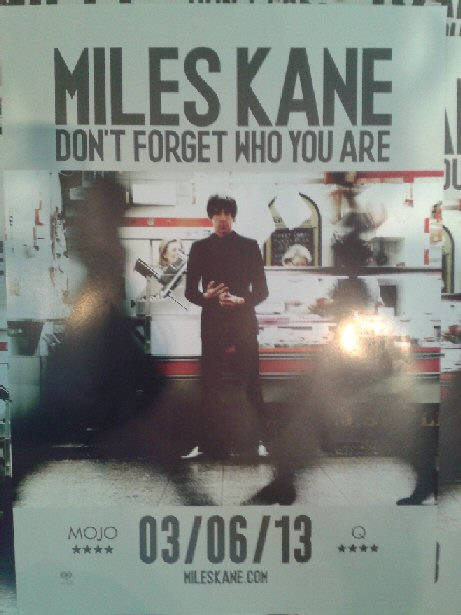
Miles Kane Advertising Poster. 


My final advertising poster, which features conventions from both Oasis posters as well as the Miles Kane poster, pictured above.


Music Video -

I watched videos from bands such as the Arctic Monkeys, Oasis, Beady Eye, Kasabian and The Courteeners and quickly discovered which technique I wanted to use. The first convention which i immediately wanted to use was the use of black and white. By watching a number of indie rock music videos, i discovered that this particular technique is tried and tested and has been proved to work. Videos such as “R U Mine?” and “One for the Road” by the arctic monkeys inspired me massively whilst deciding upon this, as I felt that the black and white technique added a certain edge to the footage. 


Also, the lack of colour added mystery to the band and allows the viewer to draw many different connotations about the artists which are featuring in the video.  Another technique which I discovered whilst analysing the Oasis video ‘Cigarettes and Alcohol’ was the use behind the scenes footage. In this particular video, the band is pictured both on stage and behind the scenes, partaking in various activities. I wanted to use this technique to add personality to the video, and portray to the audience the character of the band. I also wanted to emulate this technique to add a certain authenticity to the video, and portray the bands working class persona.  


Monday 15 December 2014

Draft Evaluation Question 2 -

How effective is the combination of your main product and ancillary texts?


By looking at the work i have produced,it is clear to see that there is a combination between my main product and my ancillary texts. The combination between my main product and my ancillary texts are extremely effective, due to the fact that a clear theme  has been used throughout, allowing each product to link together. Whilst designing each product I have used a number of techniques which allows each product to represent my chosen genre of music, the style and personality of the band and the overall meaning of my chosen song. 

My digipak, music video and advertising poster all feature the black and white colour scheme. During my research and planning, i discovered that this particular colour scheme is heavily associated with indie/alternative music and therefore, i immediately wanted to use it on my products to portray to the audience the genre of music each product is from, to highlight the alternative style of my products and to make them appear as professional as possible. Using the black and white colour scheme on all three of my products is extremely effective as a form of branding is created. By using the repetition of colours and presenting products in a specific way, the audience will become familiar with the 'brand' making the products and the band instantly recogniseable.

Another combination between my main product and ancillary texts can also be seen in my work. When i began designing my digipak, i opted to use a variety of urban images to portray the background of the band and to allow the audience to connote the meaning of the chosen song. After much analysis, i then decided to use the front cover of my digipak as the main image on my advertising poster, not just to give the audience a clear image of the album cover, but to to portray the same meanings associated with the digipak. I continued to use the theme of urban imagery whilst filming my music video. The filming took place in a band practice building, which is situated in Leicester city centre. Throughout my music video, the band are pictured walking through the streets and playing in urban settings. By filming my video in this particular setting, i was able to reinstate the previous points about portraying the bands background and the meaning of the song, as well as portray the style and genre of indie rock music; as some of the best indie rock bands have originated from the city environment. Here, the combination between my main product and ancillary texts has been extremely effective, as the use of urban imagery allows the audience to discover a number of different qualities about some of the most vital information, such as the bands background, character, the style and genre of music and the meaning of the song.

Another effective combination between my main product and ancillary texts is the simplistic way in which the products are presented. When i began my research and planning at the start of the course, i discovered that a vast amount of indie rock products are presented in a simplistic way, so that the audience can focus mainly on the music, rather than the unnecessary aesthetics which might feature in e.g. pop music products. I decided to present my products in a similar way to this. My digipak features a number of simplistic images of urban scenery and band members as well as panels which feature text, written in a simplistic, bold font which is also presented in a simplistic format. Whilst designing my poster, i emulated the techniques used on my digipak and used a simplistic layout, as well as the same simplistic font. I opted to use these techniques to give the audience a clear insight into the information which features on the page. Whilst editing my music video, i decided to present my product in a simplistic way, to link all three of my products together. By portraying the band partaking in realistic activities such as playing their song in their band practice room and the friendship of the group, i have given the audience a simplistic music video which shows the band for what they really are, and indie rock band, a group of very close friends, who do not need to use materialistic items in their musical products. By using the theme of simplicity to combine my main product with my ancillary texts, i have attempted to emulate a similar philosophy to professional indie rock musicians and designers of indie rock band products.


Sunday 14 December 2014

Draft Evaluation Question 3 -

What have you learned from your audience feedback?


Throughout this course I have received a vast amount of feedback from teachers, peers and members of my target audience. By receiving feedback on my products, i have been able to discover a variety of both positive and negative opinions. The positive opinions i received allowed me to see that my products were doing their intended job and were entertaining and enjoyable for the audience to view. The negative feedback i received came in the form
of constructive criticism and allowed me to see where and how i could improve my products. This area of feedback was extremely useful, as without it, my final products would not be at the standard that I, my teachers and my target audience were expecting.

Research and Planning Feedback -

The research and planning stage was a hectic part of the course, as a vast amount of ideas and posts had to be posted on the blog in a short space of time. During this time, i received feedback on certain posts, such as my mood board. I received comments such as "These mood boards are class! You've found a lot of images which clearly show where you are getting your inspiration and ideas from" - Jack Wildbore. I also received feedback on my 25 word pitch, which was created to give my peers and teachers a clear insight into my plans and ideas for the music video e.g. where i was going to film the video etc. "I feel the pitch gets to the point and is very good at establishing what genre you are and what you are intending to do with your video." - Matthew Hopkins.


Draft Products Feedback -

After I had posted my draft products to the blog, i received mixed responses from my teachers and my peers. Whilst analysing my draft music video, both teachers stated that aspects of my video, such as the shots of the band playing the song in their studio were extremely well done, however, neither teacher liked the idea of the outside, night time shots of the city. The two also agreed that the use of certain shots to represent particular lyrics did not have the desired effect, as they did not match or portray the correct meaning of the lyric, for example, the use of a traffic light turning to red to portray the lyric "he told Roxanne to put on her red light."

Whilst analysing my draft advertising poster and digipak, both teachers again agreed that aspects of my products were good, however, improvements had to be made.

"Jack, i like the idea of the advert and i can see how you have been influenced, however, the band logo is far too big, and the quality of the image is poor. You could also replace the iTunes logo with another magazine review, to add symmetry to the page. Similarly to your advert, your digipak contains good elements, however, once again your band logos are massively over sized, as is the text on the second panel. The back panel of the digipak is good, but where is the track list?  You also need to add more panels, to make the digipak a six panel product." - Mr Ford

Final Products Feedback -

After i had finished re designing and editing my final digipak and advertising poster, I uploaded them to the blog and once again received feedback from my teachers and my peers. "Jack, i am glad to see that you have taken my feedback into consideration and have tweaked aspects of your digipak and advert. The poster is much more aesthetically pleasing, as the use of a smaller logo makes the page appear neater. The digipak is now looking better also, as you have completed all six of the panels required. There is a huge improvement to the back panel of the digipak, due to the introduction of a track list." - Mr Ford.

"There is quite a difference between your draft and final product in both the digipak and advert. The design is similar with the same colour scheme but you have made the band logo smaller and used a different, clearer picture on the advert. I think they look a lot neater and more professional.
Also, in the digipak it is much better on the back cover with the names of the songs, as it makes the page look more professional. Overall a good improvement." - Adam Chapman. 

Final Music Video Twitter Response -

Once i had uploaded my final music video on YouTube, i opted to share my product on social networking sights such as Twitter, to gain feedback from members of my target audience (Indie Scenesters aged between 16 and 25) The following images are comments i received from members of my target audience. Sharing my video in this particular way, acted as a form of screening or premier of my music video, as a large amount of my target audience were able to view and comment on my product, expressing their own opinions.


The comments i received were mostly complimentary and very positive. By posting my final music video to Twitter, I was able to see the reactions of my target audience. By receiving positive comments, i have discovered that my video has been a success, as I has completed my original brief and have created an indie rock music video, which aims to entertain indie scenesters aged between 16 and 25.

Saturday 13 December 2014

Evaluation Question 4 -

How did you use media technologies in the construction and research, planning and evaluation stages?

Research -

During the research and planning stage i used a variety of different media technologies to create and present my work. The most important item of media technology was the internet itself, and in particular, Google Chrome. Google Chrome enabled me to carry out all of my research, and produce the majority of my work, especially during the research and planning stage. By using Google Chrome, i was able to watch existing music videos, create a blog and post my work, acquire images to use as style models and allowed me to present my work in a number of different ways due to specific websites. 


Another important item of media technology which i used during the research and planning stage was a particular website called Blogger. This particular sight enabled me to create a blog, which i then used to post my work on to. Although i used this item of media technology throughout the entirety of the course, it was vital during the research and planning stage, as without it, i would not have been able portray any of my influences, ideas or plans in a clear and organised way.


Youtube, a website which is home to millions of videos, including existing music videos, was another vital piece of media technology which i used continuously throughout the research and planning stage. Youtube allowed me to view a vast amount of existing indie rock music videos, which allowed me to discover specific techniques, which enabled me to come up with new ideas, eventually leading me to my final idea and final music video. 

At this particular stage, i began to use an item of media technology named Animoto. This website allowed me to create short 30 second videos, featuring images, text and music. This item of media technology was extremely useful during the research and planning stage of the course, as i used it to create my 25 word pitch. By using Animoto at this stage, I was able to present my work in a clear and interesting way. The use of images also allowed my teachers and peers to see clearly what i was aiming for e.g. i included the image of my filming location, to give the audience an insight into what my future video would look like.


Another item of media technology that i used during this stage was Microsoft Word. This particular item enabled me to create both word and picture documents, which i used to present specific posts in interesting, professional ways.


At this particular stage, i also decided to use a website known as Scribd. Scribd enabled me to upload Microsoft Word documents onto my blog. By using Scribd, I was able to present my work for e.g. advertising poster analysis, in an interesting and clear way. By using Scribd, i was also able to add graphics such as colour palettes and instructive arrows to my work, something i would be unable to do by publishing my work as a standard blog post.


Digipak and Advert -

Whilst creating my digipak and advert, i used a variety of different media technologies. I began my digipak journey by photographing random images during the summer holidays. 3 of the images taken during this time were used on my final digipak. The particular piece of media technology used to take these images was the camera which featured on my old phone, the HTC Sensation XE. By photographing on my phone, I was able to take a large amount of interesting photographs which were of good quality definition. I was also able to edit the images, thanks to various settings on the phone as well as image editing, social networking sites such as Instagram. I was also able to download the Blogger app. By using this particular piece of media technology, i was able to embed the images from my phone gallery onto my blog, i was then able to access the images on other forms of media technology such as the computer.


Another item of media technology which i used to create my digipak and advert was a programme known as Photoshop. Photoshop enabled me to build my products layer by layer. The programme allowed me to carefully choose the page measurements, import, re-size and edit images and add and specifically place text. By using Photoshop and building up my pages, layer by layer, i was able to create a six panel digipak alongside an advertising poster which looked extremely professional, coincided with my chosen genre of music and the image of my band and appealed to my target audience. 


Music Video -

Whilst filming and editing my music video i used a range of different media technologies. I began this stage by filming my band using the Panasonic HC/V700 Full HD. By using this piece of media technology, i was able to produce a vast amount of high definition footage, which gave my final music video the professional edge i was looking for. By using this camera, I was also able to take professional images of the band. Due to the fact that the photographs were extremely good quality, i opted to use 2 of the best on my final digipak.


During  my filming, i also used a tripod. The tripod enabled me to film key footage in an extremely stable way. This particular piece of media technology enabled my footage to appear as HD as possible, which made the final music video appear more professional.


Whilst filming my video, I also used my Iphone 5C an AUX cable
and a Marshall speaker. By connecting the cable to my phone (which featured my chosen song) and plugging the cable into the speaker, my band were able to mime in time with the song, making the final footage appear more professional and realistic. Also, the use of these items of media technology made the editing stage a lot easier, as i was able to match the music on screen with the imported song, making the lip syncing a lot less challenging.


During the editing stage, i began to work on an Apple Mac, in order to access a specific editing programme called Final Cut Pro X. During the editing stage, I used another form of media technology to import my footage from the camera onto the computer and onto Final Cut Pro; this particular piece of media technology was an SD card. In order to import my footage from the camera onto Final Cut Pro, i inserted to SD card into the mac. Once the footage had been imported, i began to select specific clips and began to shrink them down using the editing tools. Once I had created a rough sequence, i returned to Google Chrome and opted to use a particular website called Youtube to MP3 converter. This particular sight enabled me to transform my chosen song 'When The Sun Goes Down' by The Arcitc Monkeys from a Youtube video, into an mp3 file. I then uploaded the mp3 file onto Final Cut Pro and placed it above my footage. by muting the sound of the footage and matching the film in time with the song, i was able to create my final music video, which i then edited into black and white. Once again i returned to Youtube, and uploaded my final video. I then opted to share it embed it onto my blog.